City Deluxe
Michael Morris
November 20 - December 23, 2020

Paul Petro Contemporary Art is pleased to present exhibitions by Nelson Henricks and Michael Morris.
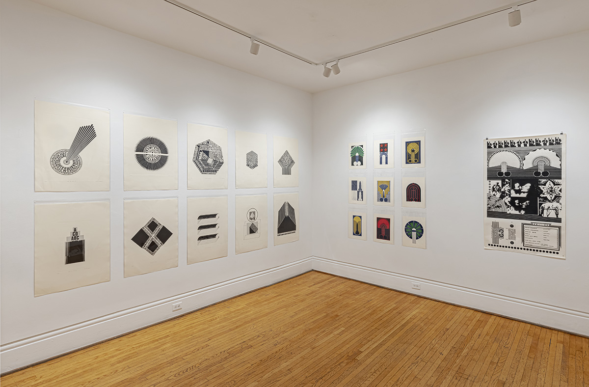
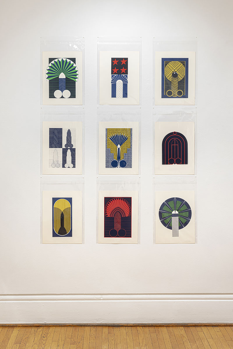
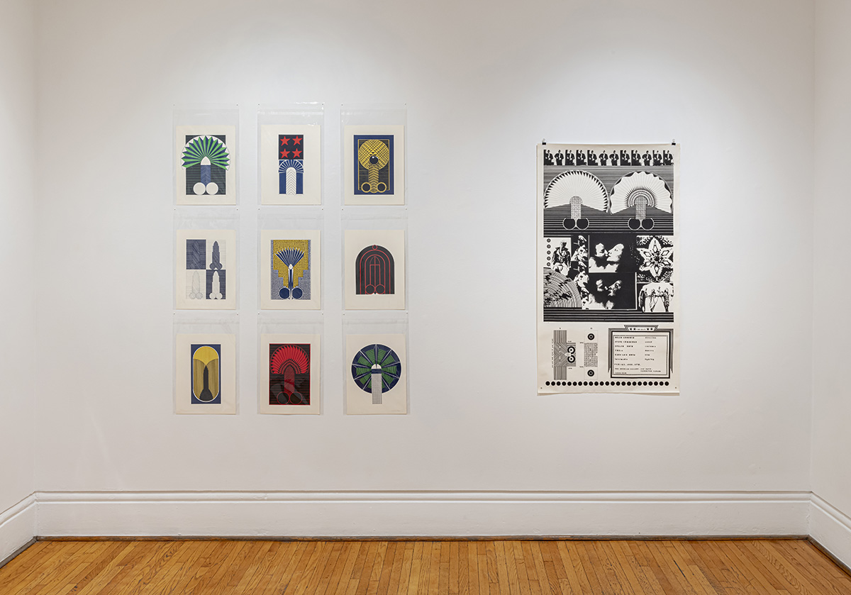
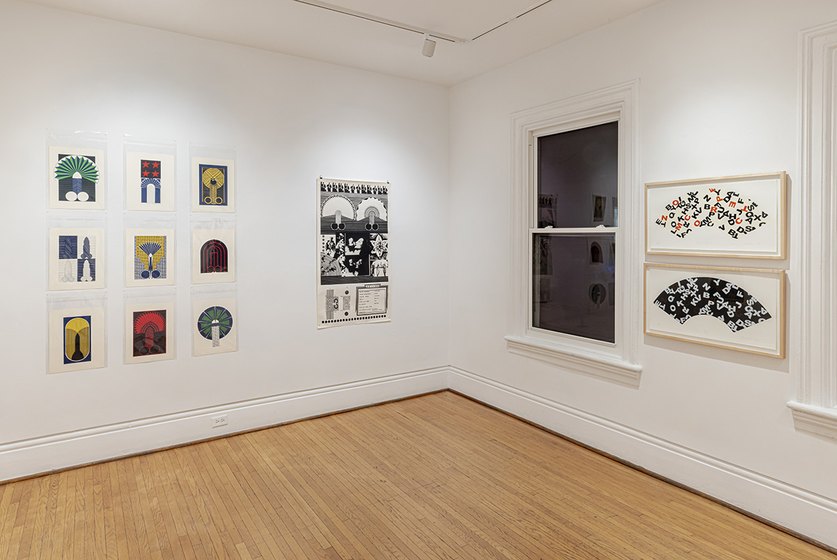
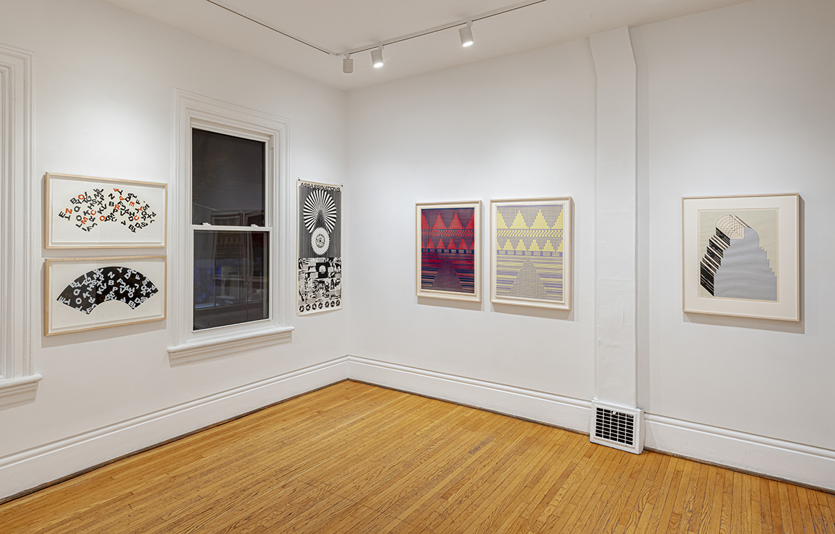
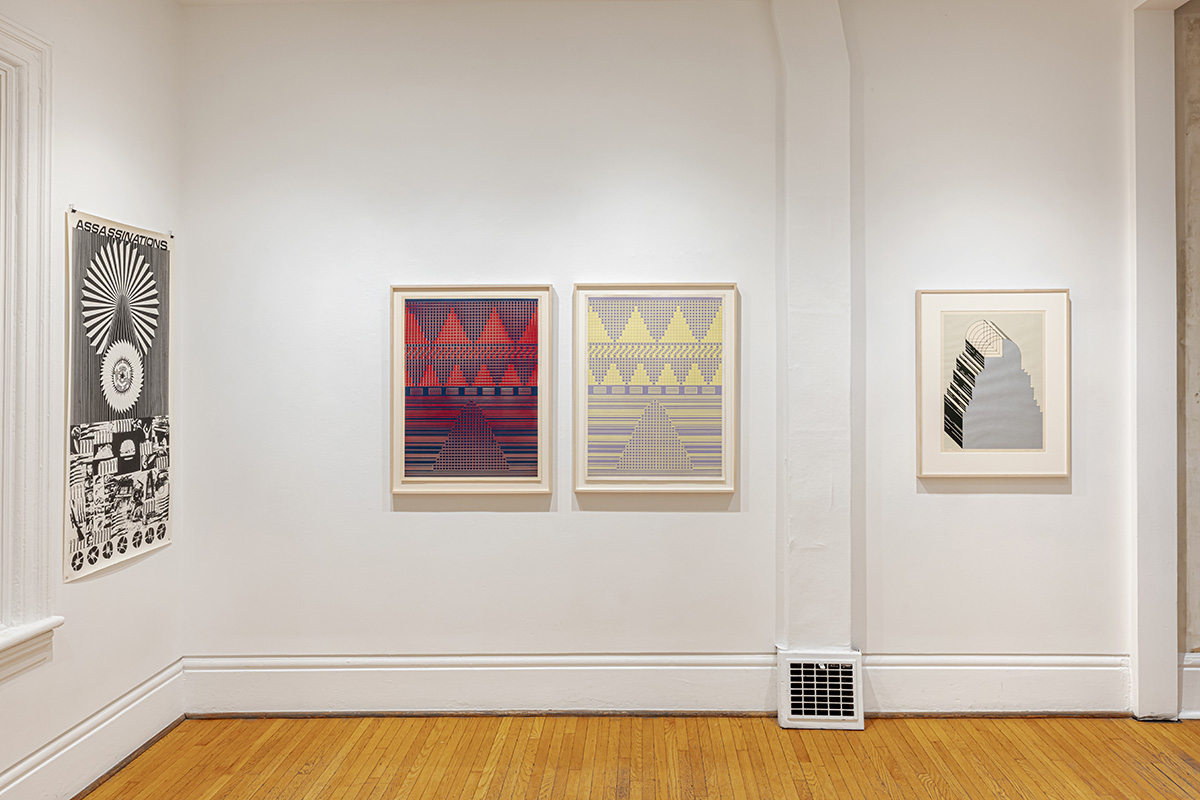
Henricks' latest work, Winter Fruit, expands on the work found in his last exhibition, Lacuna (Alas Poor Yorick!), by diversifying, across several mediums, his references to the lacuna in architecture and the black page found in Lawrence Sterne's The Life and Opinions of Tristram Shandy, Gentleman (1759). Brought into juxtaposition with City Deluxe, an assemblage of printed works by Michael Morris from the 1967-1972 and a suite of etchings from 2012, the exhibitions open up a dialogue on abstraction that crosses generations between artists and reaches back, via Josef Albers, to Sterne's time.
Tristram Shandy is a farcical autobiography published in nine volumes between 1759 and 1767. The novel is highly experimental, exploring the limits of typography and print design. For example, in Book 1, Chapter 12, a page printed entirely black appears at a point in the story when a character named Yorick dies. On one hand, the black page can be understood as an overflowing of ink and emotion representing inexpressible grief. On the other hand, it is like an image of an open grave: an opening, an absence, a void.
Using Sterne’s black page as a starting point, Henricks developed two series of paintings, two series of photographs, and several mixed media works. On one level, the project is an exploration of the history of modern art. Sterne’s black page both predates and anticipates 20th century monochrome, a history that traditionally begins with Malevich’s paintings Black Square (1915) and White on White (1918). Henricks excavates a prehistory of monochrome, one that originates in farce, rather than in formal or spiritual concerns.
Found in these related bodies of work lie several intersections with Michael Morris, whose practice dates back to the 1960s. Morris references 20th century painting and architecture with allusions to the monochrome of Josef Albers and the architecture of Le Corbusier’s Pavillon de l’Esprit Nouveau amongst others, adding another source with the geometric patterning found in Busby Berkeley musicals. Curator Scott Watson has famously described Morris’ work as being painted by the light of the cinema lumière. The artifice implied by this antithesis to northern light points to the stage theatrics and the film noir tone found in Morris’ work and suggests the queering of abstraction he has undertaken.
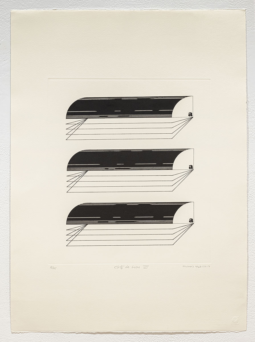
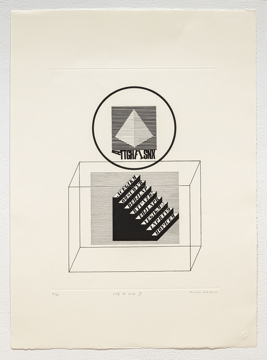
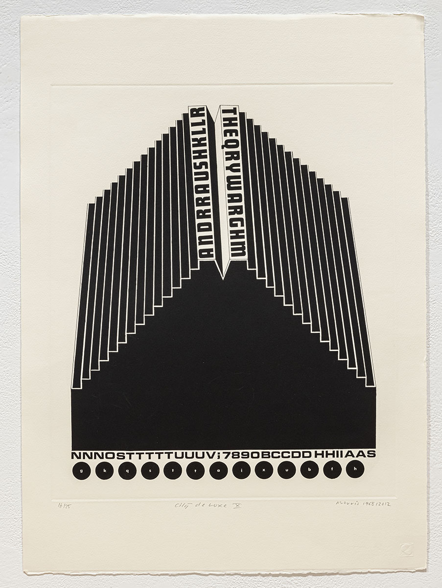
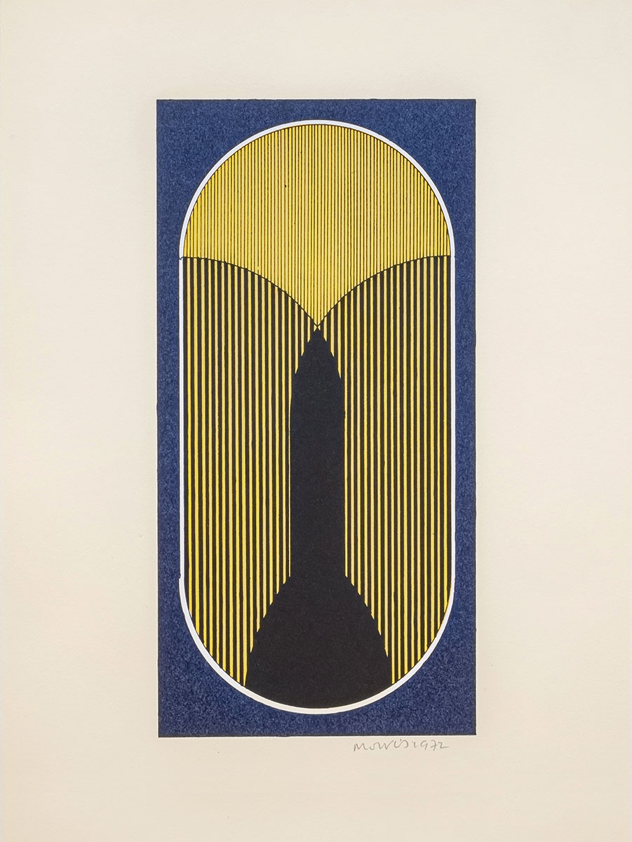
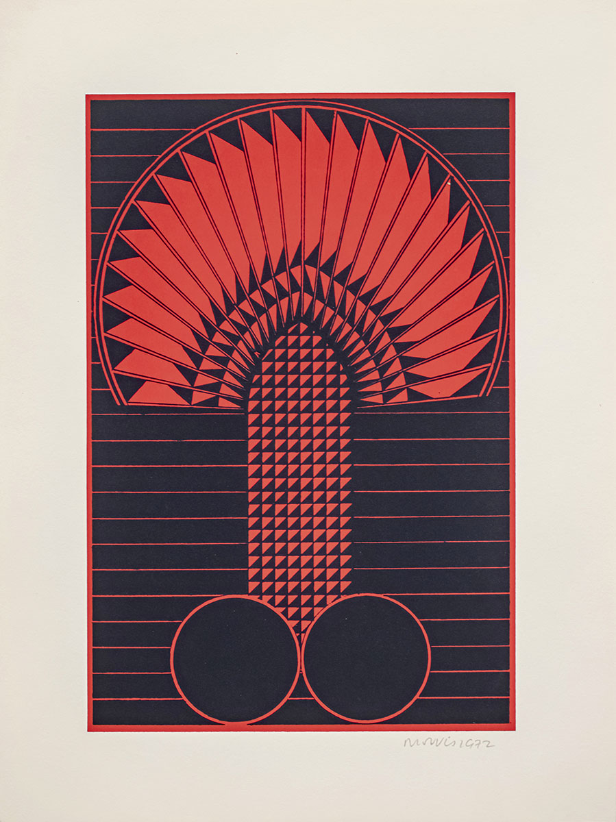
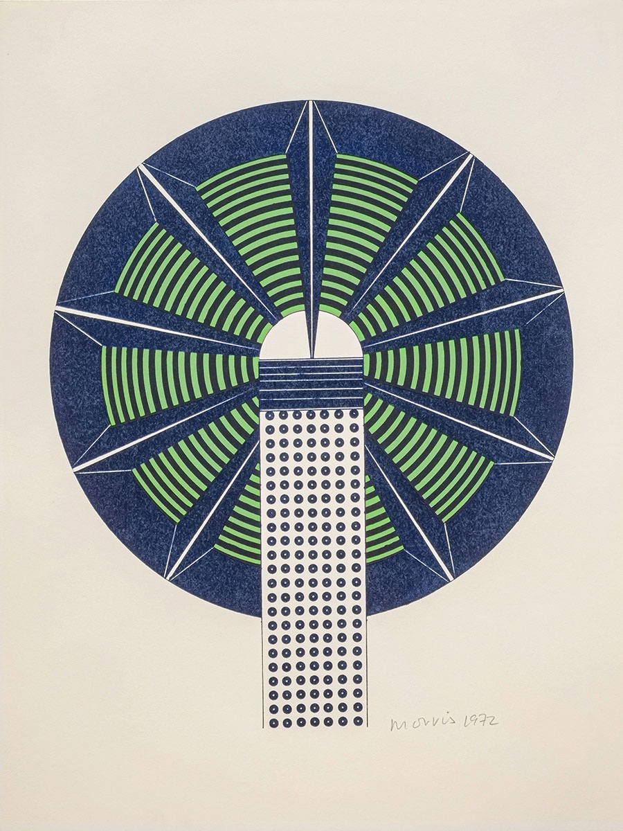
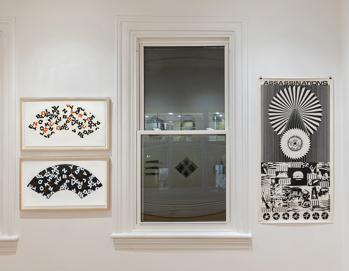
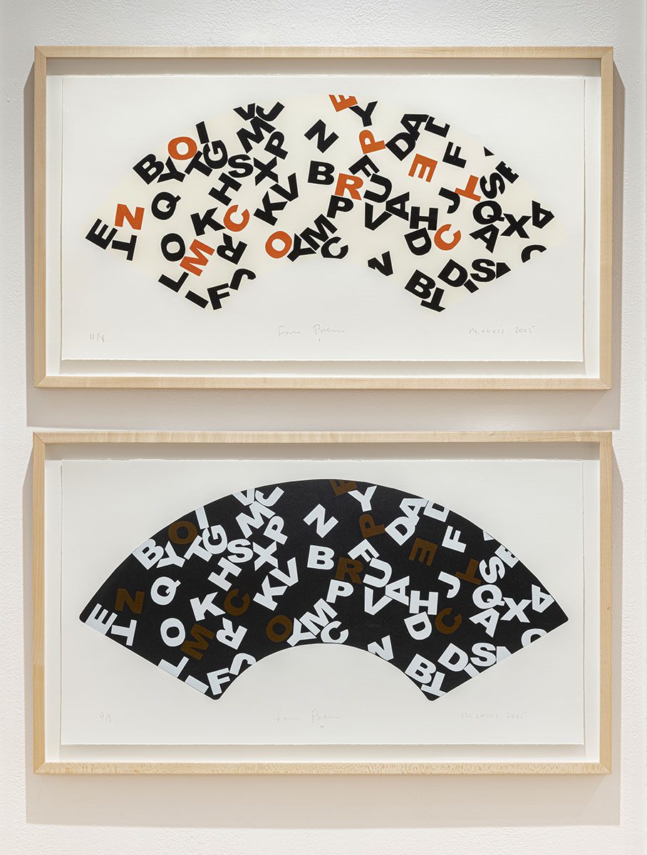
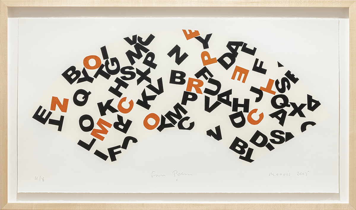
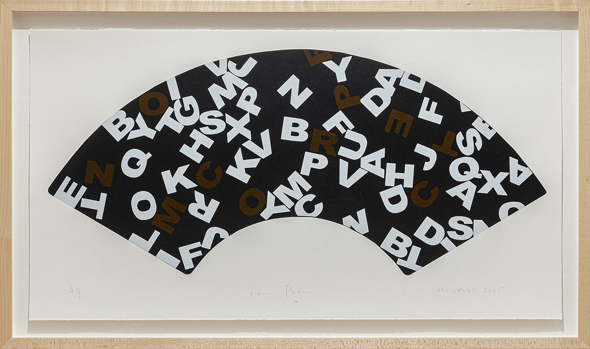
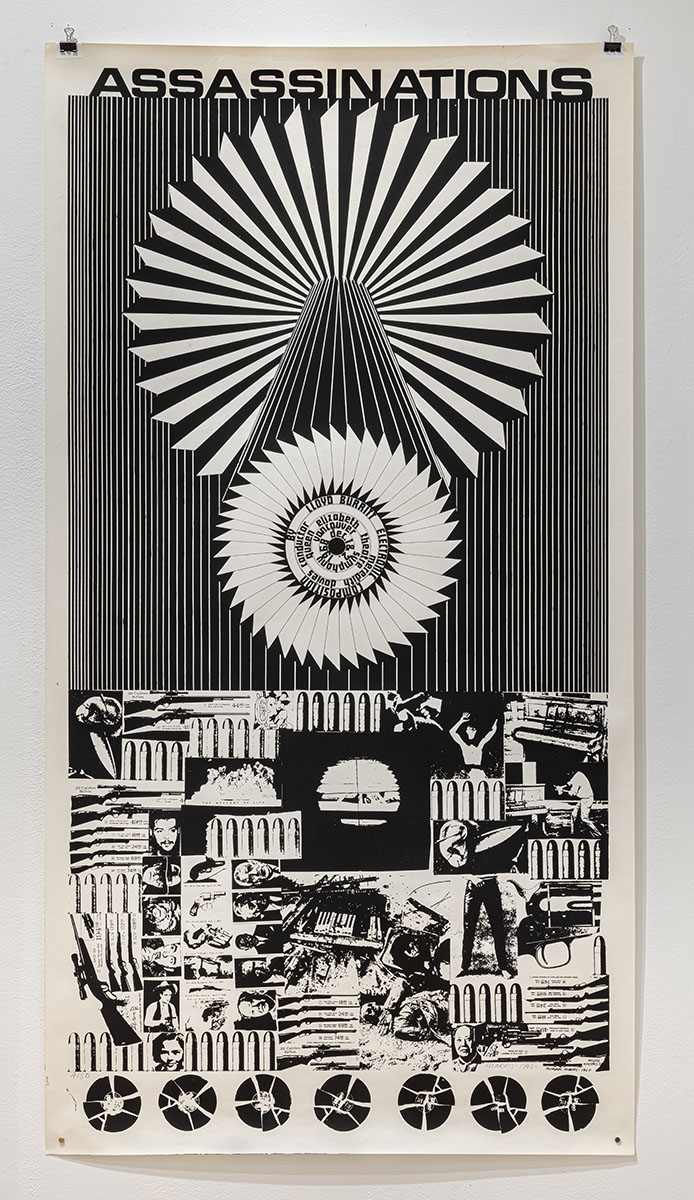
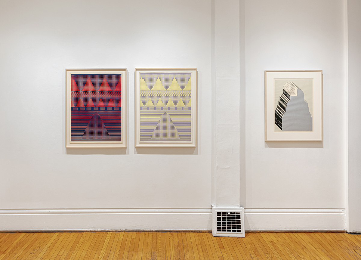
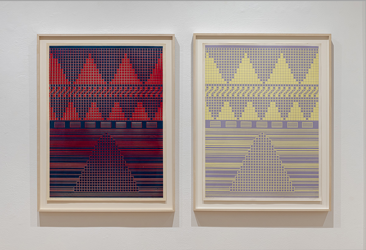
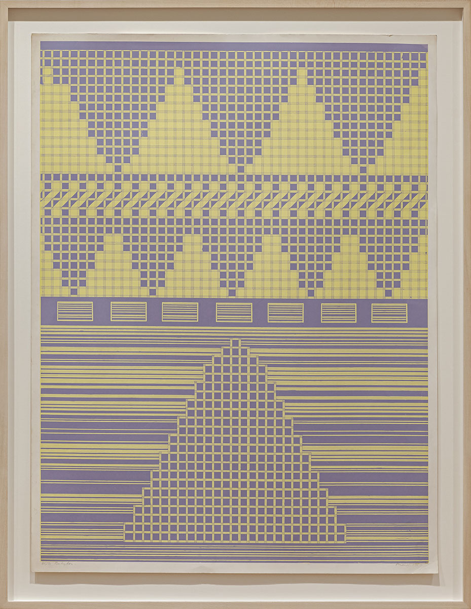
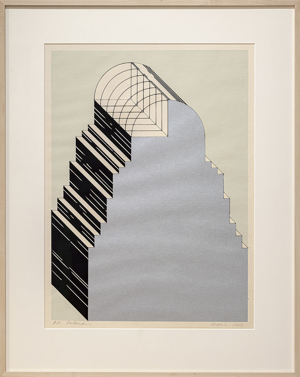
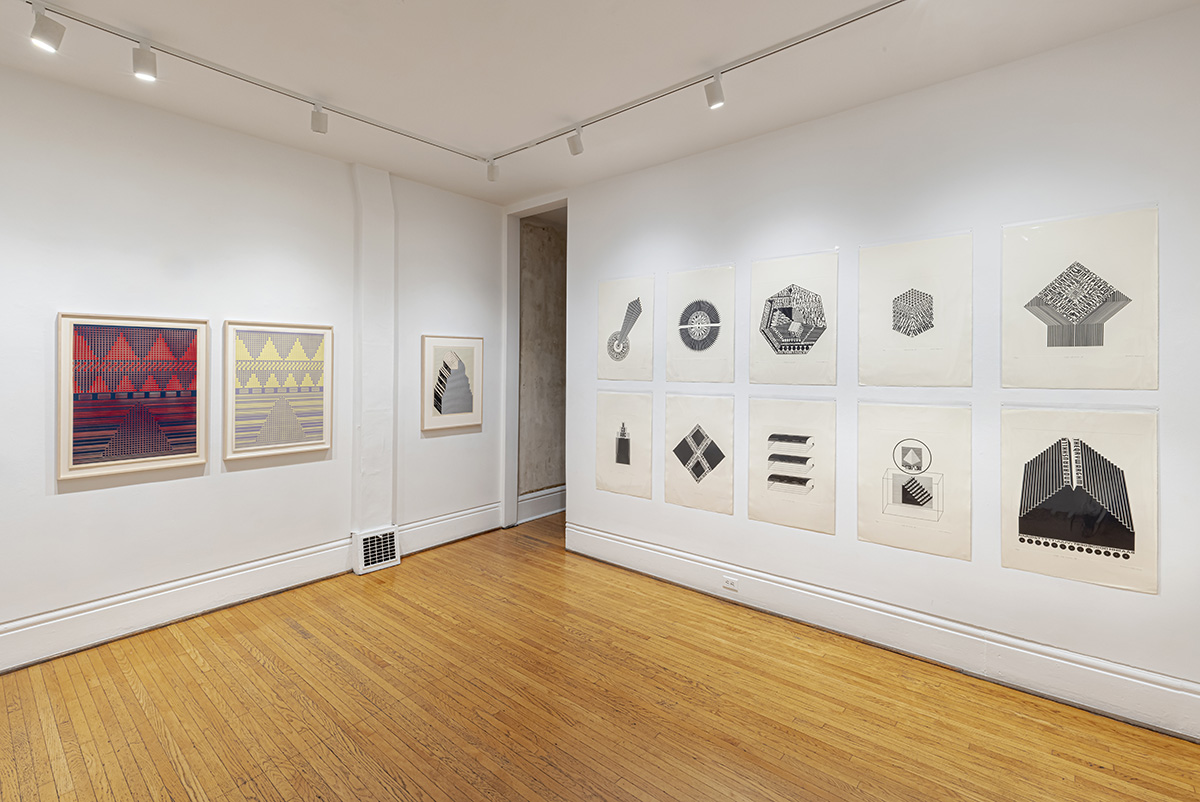
In Morris' exhibition, City Deluxe, showing concurrently with Henrick's Winter Fruit, there is a suite of etchings from 2012 that originated as drawings produced in 1968 and have motifs which extend into silkscreened prints and posters also found in the exhibition. It is here that we find the allusions to Busby Berkeley and a site where the world is a stage, and where the glamour of Old Hollywood and camp converge. And it is here that we encounter the seemingly coded aesthetics of concrete poetry, where the eye learns to see image meaning while trained to look for words, like the secret door found in the wood panelling of a home library or the key to a heart.
Working ideas across several media is common to both artists and informs their concepts about research. In the case of Morris there are more than forty years of ongoing Colour Research which inform much of the Morris/Trasov archive and remains a dominant exploration in his work (we explored colour bar research in his survey exhibition in 2018). And with Henricks we have a succession of Lacuna-inflected exhibitions that explore the site of production (the studio) and the site of exhibition (the gallery). To this end Henricks and Morris share a polychromatic colour spectrum pursuit and their exhibitions disclose the elongated effects of their research and lab experimentation, and that which resides "off-stage" in the shadows of chance and repetition, or, as Henricks' smaller-scale maquettes and wallpaper can suggest, in urban home decor.
MICHAEL MORRIS: ILLUSION, ALLUSION, AND AN IDEA OF THE CONCRETE
By Robin Laurence
It is striking how many of the themes and issues of 1960s counter-culture inform our 21st-century lives. Environmentalism, the advocacy of human rights and social justice, the organic food movement, Eastern approaches to healing, fitness, and spirituality, these ways of thinking and being were championed in the sixties by a generation that significantly challenged the status quo. Genre-busting approaches to the making and exhibiting of art that have been subsumed into contemporary cultural practice were also proposed in the critical decades following the Second World War. This is one of the reasons why Michael Morris’s concrete poems, first created as mixed-media drawings in 1968 and now reissued as etchings, are compelling and contemporary. They are smart, elegant, playful, and subtly provocative -- of a time that persists with us and through us. They express a set of perceptions that have shaped our cultural understanding of the world.
A man of both charm and candour, Morris describes the work he made in the 1960s as “pre-Postmodern.”¹ This resonant term suggests the interdisciplinary, multimedia, and socially oriented forms that followed, both in the international art world and through his own career. Integral to Morris’s segue from painting and printmaking to performance, photography, video, correspondence art, networking, and Fluxus-style events and gatherings was and is concrete poetry. As his work shifted focus from the individual to the collaborative, from the permanent to the ephemeral, and from the masterful to the playful, it was actively dissolving the lines between disciplines and erasing social, political, and cultural boundaries. Again, concrete poetry was the gateway to Morris’s ability to dissolve and erase, to play and provoke, to engage in the Postmodern project.
Definitions of concrete poetry often overlap with those of visual poetry. In the latter, elements of written language – words, sentences, punctuation marks, line lengths, spacing, and other typographical qualities including the shape and colour of the characters – are conceived in such a way as to enhance the poem’s syntax and convey its literary content. Visual poetry is intended to look like and therefore convey its literal meaning. The kind of concrete poetry that Morris has created, however, adheres to a more strict denotation of the term, in which the elements of language are reduced to their most “concrete essentials.”² In concrete poetry, words, letters, numbers, glyphs, signs, symbols, fonts, and accents function purely visually, “free not only of semantic but syntactical necessities.”³ In Morris’s work, they are the raw material used to create or complete the forms and patterns of his drawings. They are building blocks in the construction of an abstract architecture.
Concrete poetry cannot be read as literature because it is “linguistically incomprehensible.”⁴ Even while it conjures up a visual presence, establishes a formal entity on the page, language is treated as an “opaque” rather than transparent medium.⁵ There is an “emphasis upon manipulation of exterior form rather than central content”⁶ that may be seen as characteristic of Modernism, especially abstraction. But concrete poetry may also be, as Morris suggests, a step towards Postmodernism. The “pre-Postmodern” condition of his concrete poetry has as much to do with his multiple art-historical and popular-culture references as it does with smudging the line between disciplines.
The concrete poetry movement, which emerged internationally in the 1950s, has strong literary and visual precedents, the former including Un Coup de Dés by Stéphane Mallarmé, the “calligrammes” of Guillaume Apollinaire, and the shaped poetry of e.e. cummings. Avant-garde art movements of the early 20th century, such as Dadaism, Cubism, Futurisim, Imagism, Orphism, Vorticism, and Constructivism, all contributed to an understanding of the formal possibilities of written language and typography. The incorporation of words, letters, and numbers into early Modernist paintings pointed the way to the possibilities of their concreteness, freed from the restrictions of traditional typesetting as well as from any literary moorings. The typographical experiments deployed in Futurist, Vorticist, and Constructivist posters and publications sought to wed the social message to the medium long before Marshall McLuhan walked onto the communications-theory stage.
Morris first encountered concrete poetry in London in the mid-1960s, when he was a graduate student at the Slade School of Fine Art. In 1965, he attended a concrete poetry exhibition titled Between Poetry and Painting at London’s Institute of Contemporary Arts and met a number of the new discipline’s leading proponents, including Dick Higgins and Emmett Williams. Both men were also part of the Fluxus movement, another important influence on Morris’s subsequent experimental art making. (Higgins is credited with coining the word “intermedia” to describe his cross-disciplinary practice, which included music, poetry, and printmaking.) Morris recalls that he was excited that concrete poetry, because it used language as a visual rather than verbal form of communication, had neither national nor cultural borders. “There were Japanese concrete poets and South American ones and European ones and I think that had a big influence on me in terms of being interested in networking,” he observes.
Excited and energized by what he had seen and heard, Morris returned to Vancouver in 1966 and became an important conduit between Canada’s West Coast and the avant-garde and experimental art scenes of London, New York, and Los Angeles. Initially, Morris consolidated a solo career that was acclaimed for both its technical facility and its intellectual ambition. He exhibited frequently and was written about in local, national, and international papers and magazines. And he produced a flood of inter-related art works that included abstract and mixed-media paintings (some of which were shaped and included mirrored and Plexiglas panels), silkscreen prints, and concrete poetry.
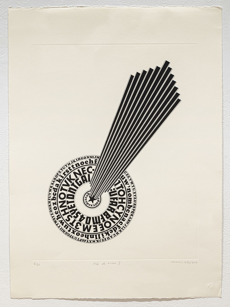
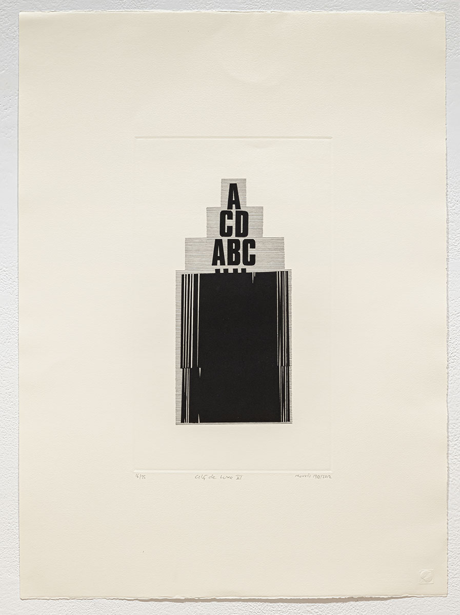
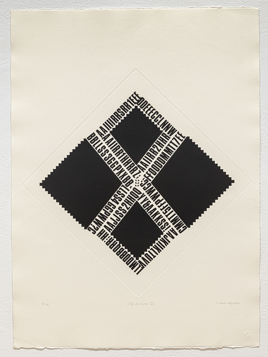
The City Deluxe print portfolio is composed of ten etchings produced by digitally scanning original drawings that Morris created in Letraset, Zip-A-Tone, and India ink in 1968. These concrete poems were originally titled Letter Drawings, in reference to his series of large scale, abstract Letter Paintings made during the same period. The drawings were intended to be reproduced in a highly personal, unbound, limited edition book that would also include Morris’s photographs, collages, and other “unclassifiable things.”⁷ Although the book was project was never fully realized⁸, the concrete poetry drawings were reproduced in a smaller scale and exhibited on a screen in the 1969 Concrete Poetry exhibition at the UBC Fine Arts Gallery. Co-curated by Morris and gallery director Alvin Balkind, the show was ground-breaking in its conception and its scope. It introduced Vancouver audiences to an international roster of concrete poets as well as to the correspondence art of Ray Johnson and the idea of networking. It also revealed Morris’s early interdisciplinary direction, and his concrete poem drawings attracted the patronage of the Canada Council Art Bank.
While some concrete poetry may assume an organic or gestural aspect, Morris’s works are highly geometricized and hard-edge. Their allusions range widely, from ancient and modern architectural forms and styles to Russian Constructivism, urban signage and the art it inspired, minimalist sculpture, mechanical forms, and Depression-era film, particularly Busby Berkeley movies. Berkeley was famous for shooting his precision- choreographed routines from above. In these scenes, crowds of uniformly shaped and costumed dancers unfold into kaleidoscopic patterns suggestive of, say, snowflakes or water lilies.⁹ To Morris, these dance sequences are fascinating because of their “soft-core Surrealism.” The films themselves functioned for viewers as temporary dream worlds, gorgeous fantasies, eroticized respites from the crushing social and economic conditions of the Great Depression.
Of his architectural references, Morris draws equally from ancient ziggurats and 20th-century Art Deco towers. At times he employs a soaring, aerial point of view that mimics Berkeley’s camera. The ziggurat form compelled Morris because of its standing as an archetypal symbol within the terms of Jungian psychology. As with the pyramids of Egypt and the temples of pre-Columbian Mesoamerica, the stepped ziggurats of ancient Mesopotamia symbolized the “Mountain of Heaven”, their summits or peaks seen as the place where the earth meets the sky – and humans meet their gods. Conversely, the Art Deco references evoke American movie palaces of the 1920s and 30s, which again offered a glamorous form of escape from the dreary exigencies of life. For Morris, the Art Deco and Busby Berkeley references were a way of introducing the element of play into his otherwise sombre black and white drawings – and that playfulness clearly reflects the influence of Fluxus on his practice. Morris’s concrete poems also respond to what he describes as the “brashness and strength” of the typographical experiments of early Modernists such as El Lissitzky and Wyndham Lewis.
Not incidentally, Art Deco design was considered during its time to be the height of modernity, echoing the streamlined character of the machine age. Within the context of Morris’s architectonic and mechanistic forms, his chosen letters, numbers, and punctuation marks may function as either integral components of the overall structure, or decorative mosaics atop a flight of stairs or a stepped tower. They make abstract visual sense rather than literal verbal sense being, again, opaque rather than transparent. Morris says that he and his peers were breaking down “the analog,” making nonsense out of established forms of communication, as if in anticipation of the digital age. The enitre City Deluxe series is highly eclectic, summoning up aspects of life and art across the whole of the 20th-century art – and calling that summary forward to our Postmodern sensibilities.
During the same late-1960s period in which Morris produced his concrete poetry, he was also experimenting with a number of other media and materials, including printmaking, photography, and large paintings on canvas conjoined with mirrors and Plexiglas. Among these diverse expressions of his essential themes was a series of silkscreen prints on Plexiglas or acetate. Working with master printer Bill Bonneyman, Morris created hard-edge images in brilliant colours on these transparent materials, eliminating the relationship between figure and ground essentially by making the ground disappear. This was a way of pushing Theo van Doesburg’s idea of Concrete Art towards creating a painting or a print or a drawing that exists as an object unto itself. Van Doesburg and his followers advocated an entirely abstract art predicated on geometry rather than on a likeness to anything in the natural world, thus focusing fully on formal qualities such as line, shape, and colour. Morris furthered the concreteness of these formal qualities by separating them from their familiar lodging on a white sheet of paper which, conventionally, would be framed and hung on the wall. His serigraphs on Plexiglas are intended to be suspended in midair, unmoored from established exhibition practices -- just as concrete poetry is unmoored from literature.
Morris’s Acetates – his silkscreen prints on acetate, cut out and sandwiched between pieces of Plexiglas -- enjoyed wide exposure in a National Gallery of Canada touring exhibition in 1969. These signal works share a number of elements with his concrete poetry including, in some instances, their seeming resemblance to letters of the alphabet and their participation in the idea of the façade or the false front.¹⁰ Again, allusions to architectural forms and facades intersect with other forms of creative expression. Still, behind the glossy quality of both the concrete poems and the Acetates series of prints lay a decided melancholy and a preoccupation with “the problem of nothing.” On the one hand, the concreteness of the Acetates and the concrete poetry suggests the eradication of anything other than strictly formal qualities. On the other hand, Morris’s work inevitably incorporates allusions to themes and subjects that were and are meaningful to him: the gloss in some sense distracts us from the deep melancholy that permeates his work, just as the Busby Berkeley musicals were intended to distract audiences from the conditions of the Great Depression.
Morris was pushing the boundaries of his chosen media, conceiving all his late 1960s projects in terms of interdisciplinarity. While his concrete poetry fused visual and linguistic elements, his paintings and prints at the time could be seen as “props” before which some kind of performance could take place, expanding the discourse between art and audience.¹¹ The concrete poems and the prints on acetate incorporate shifting concerns in an unstable art world while also factoring into what Morris calls “the Duchampian project,” that is, editioning ideas from one period in a later one. The ongoing “Morrisian project” speaks of thematic continuities through a range of practices, media, working conditions – and time. It rings its relevance into every new year.
(Originally published by Kardosh Projects, Vancouver, October 2013)
¹ Michael Morris in conversation with the author. Unless otherwise indicated, all direct and indirect quotes by the artist derive from interviews conducted November 26 and December 7, 2012 and September 10, 2013.
² Richard Kostelanetz et al, Dictionary of the Avant-Gardes (Chicago: a capella books, 1993), p.45.
³ Ibid.
⁴ Ibid.
⁵ Ian Wallace, “Literature – Transparent and Opaque”, from the exhibition catalogue Concrete Poetry (Vancouver: UBC Fine Arts Gallery, 1969), unpaginated.
⁶ Ibid.
⁷ Alvin Balkind, letter to Walter Hopps, September 19, 1968, cited in Scott Watson “Letters”, a work-in-progress, 29 April 2013.
⁸ The book project was described and interpreted in an essay by Kurt von Meier, which appeared in the August 1969 issue of artscanada, and also in the Concrete Poetry exhibition catalogue.
⁹ Robin Laurence, “Michael Morris: Of Words, Wiliness and Wisdom”, Border Crossings magazine (Volume 32, Number 2, June-July-August 2013), p.86.
¹⁰ Michael Morris, in e-mail correspondence with the author, October 9, 2013.
¹¹ Laurence, op. cit.
MICHAEL MORRIS was born in 1942 in Saltdean, England and immigrated to Canada at age four. After he graduated with honours from the Vancouver School of Art (now Emily Carr University of Art + Design) in 1964, Morris studied at the Slade School of Fine Art at the University College London. There he absorbed the work of Fluxus and the European avant-garde, artistic developments that had a profound influence on Vancouver’s experimental art scene. When he returned to Vancouver, Morris became a curator at the Vancouver Art Gallery and the Centre for Communications and the Arts at Simon Fraser University. In 1973, Morris and seven fellow artists (Martin Bartlett, Mo Van Nostrand, Kate Craig, Henry Greenhow, Glenn Lewis, Eric Metcalfe, and Vincent Trasov) co-founded the Western Front — one of Canada’s first artist-run centres — and he served as its co-director for seven years. Michael Morris was awarded an Honorary Doctorate of Humanities in 2005 by Emily Carr University of Art + Design. In 2011, he received the Governor General’s Award in Visual and Media Arts. Morris currently lives and works in Victoria, BC. The University of British Columbia's Belkin Art Gallery hosted the exhibition Letters: Michael Morris and Concrete Poetry, January 13 – April 8, 2012. In 2018 Paul Petro Contemporary Art mounted the exhibition, Toronto Letter - A Concise Colour Bar Survey 1966-2017.
