Toronto Letter - A Concise Colour Bar Survey 1966-2017
Michael Morris
with paintings, works on paper, prints and video
March 30 - April 28, 2018

Paul Petro Contemporary Art is pleased to present Toronto Letter, a concise survey of work by senior Canadian artist Michael Morris. With paintings, works on paper, prints and video, the exhibition traces the formal motif of the colour bar and its chromatic variants, through five decades of the artist's work.
The Letter Paintings
Originally created in the late sixties and early seventies, these canvases were composed of vertical bands of graduated colour and divided into triptychs by plexiglass and concave mirror inserts. The Letter Paintings were named after the "Letters" column in Art International magazine, "London Letter", Paris, New York, Rome etc. The titles underline the artist's desire to avoid the parochial and rather to address the world. Conceived to address urban architectural spaces these large scale works have a performative aspect. They are meant to be "walked by", allowing the work to be seen interactively, not looked as an object. Yet the works have an elegance, an integrity, that goes beyond "wallpaper." The artist feels that his ideas are still relevant today and through collaboration between artist, architect and urban planners, and by using new methods and materials, new and exciting commissioned works are possible.
The Colour Bar Project: 1970 - 1978
The colour bar is a tool. We (Vincent Trasov and I) said it was a "visual aid", a prop to frame our practice as artists concerned with life as art and our activities, both urban and rural. The origins of the colour bar came out of "Intermedia", the collaborative and multi disciplinary society founded in Vancouver in 1967. The first thousand colour bars were painted in monochrome in the seven colours of the spectrum at our city studio in Vancouver through the assistance of an L.I.P.(Local Initiative Project) grant in 1971. The second thousand colour bars were painted in the full spectrum, in nine shades from dark to light plus 100 painted as greyscale, and painted at our country studio in Robert's Creek, B.C. in the following year. The painted colour bars were initially used for documentary and performative purposes and grew to be a unique "language" by itself.
This exhibition traces the development of these concerns as they have evolved to create a continuing body of work in the spirit of collaboration.
To go back to another time is never easy, particularly for the seventies, a period when artists questioned all that had come before. We were not the exception. Our collaboration began in 1969 when we started "The Image Bank" a method of creating an artist network communicating through the post. The popularity of this activity prompted us to develop more projects with other artists beyond our own community. By 1973 we, with six fellow artist in different disciplines, founded the Western Front Society, a center for production and presentation of new art activity. The Western Front became our home in the city for the best part of the decade. Subsequently, our retreat in the country at Robert's Creek became the site for interaction with the artists who were our guests while they were working at the Western Front. This discourse of art and life, town and country became the root of what's best in our work."
-- Michael Morris, from an email correspondence in December 2017.
Born in England in 1942, Michael Morris grew up in Victoria (BC) in an artistic environment where his mother, an art teacher, fed and nurtured her son's voracious appetite for art with understanding. A child prodigy, with artists Maxwell Bates and Karl Sprite as family friends, he studied for two years at the University of Victoria under Herbert Siebner before moving to Vancouver, to the School of Art, to study with Jack Shadbolt, Don Jarvis and Roy Kiyooka. He left Vancouver in 1965 with a Canada Council fellowship to do post-graduate work at the Slade School of Fine Art, London, where he studied with, amongst others, Ron Kitaj and Harold Cohen.
He began modestly in London, working on a new series of small gouaches painted on paper and card stock. Talking about these small gouaches today, he remembers that they evolved in part out of his fascination with Indian miniature paintings he saw at the Victoria and Albert Museum shortly after arriving in London. These miniatures, with their small scale, flat design, painted frames and pure colour, were painted primarily with gum arabic bound paints, which was also the binder of the gouache paint he began to use, drawn to their flat, vivid colours and their immediacy. Over the next year in London, out of his small, cramped flat, he did a number of these gouaches, working out his ideas for future paintings.
The first gouache, The Problem of Nothing (1965) was Morris' answer to the formal problems of format and perspective. A phallocentric column in oblique perspective sits on a fat blue bar "ground" suspended in front of a stylized curtain of chromatic stripes in graduated tonalities of reds, pinks and whites, flanked on both sides by white borders. Out of the top of this column is a comic strip style "talk" balloon saying nothing other than another field of horizontal green, yellow ochre and white stripes. The Problem of Nothing was at once a profound yet absurd statement, a new spatial sensation of ambiguous scale, ambitious yet opaque in meaning. It was a definitive statement for a young 23-year-old artist.
The Problem of Nothing gouache also introduced and established many of the formal motifs, devices and concerns which occupied Morris in his paintings over the next several years: the abrupt collage aspect of delineated areas butted against other irregularly shaped areas of colour; the optimality of the rhythmic patterning of these colour areas, with the stylized chromatic graduated stripes; the conceit of perspective and the acknowledgement of pictorial illusion; the oblique nonconverging perspective; and, finally, the irregularly "shaped" painting within the rectangular format.
-- David MacWilliam, The Problem of Nothing, from the exhibition catalogue Letters: Michael Morris & Concrete Poetry, Morris and Helen Belkin Art Gallery, UBC, 2012.
In his roles as an artist, curator and educator, Michael Morris has been a key figure of the West Coast art scene since the 1960s and his contribution to the development of Vancouver as a contemporary art city has been profound. He was central to the "scene with no scene" that emerged in the late 1960s and was a leader in the turn to the conceptual in the early 1970s, co-founding Image Bank in 1969 and the Western Front in 1973. In 1981, Morris and Vincent Trasov accepted a residency in Berlin as guests of the D.A.A.D. Visiting Artist program. He stayed for 13 years, joining the ex-pat art community in what was West Berlin, returning to Victoria, British Columbia in 1994. Image Bank, now the Morris/Trasov Archive, has resided at UBC since 1992 and it is the central hub of the Gallery's increasing involvement in the archival. In 2011, Michael Morris was awarded the Governor General's Award in Visual and Media Arts in recognition of his career achievement and outstanding to contemporary art in Canada.
-- Scott Watson, Director/ Curator, from the exhibition catalogue Letters: Michael Morris & Concrete Poetry, Morris and Helen Belkin Art Gallery, UBC, 2012.
from Fugitive Pigment, a blog of art writing about painting, by Earl Miller:
Michael Morris
Toronto Letter – A Concise Colour Bar Survey 1966 - 2017
Paul Petro Contemporary Art, March 30 – April 28, 2018
Rarely does a private Toronto gallery mount an exhibition that puts the curation of public galleries to shame. Toronto Letter – A Concise Colour Bar Survey 1966 – 2017 is one of them. This five-decade survey of British Columbia-based painter Michael Morris, which Paul Petro curated, stands out for succinctly linking abstract painting to quotidian life, and in doing so, enhances the history of modern painting in Canada by countering the frequent portrayal of abstraction as autonomous.
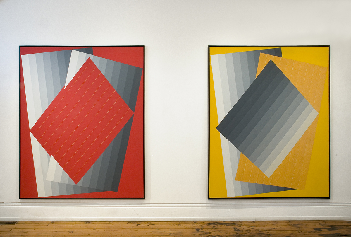
This exhibition of paintings, video, and works on paper stems from two key influences that develop the exhibition historically and theoretically: The Letter Paintings and The Colour Bar Project: 1970 – 1978. Each of The Letter Paintings (1968-9) comprise graduated vertical colour bands. The series’ title, referring to written letters, signifies a communique with the outside world. Accordingly, the paintings are not discrete: the act of walking by them as if they were part of a streetscape is integral to their interpretation. These are influential paintings, and not just here in this survey. Their lineage can be seen, for instance, in Ian Wallace’s photographs pairing street scenes with Modernist abstract forms. Referencing the series in this exhibition are more recent paintings including Gelbe Liebe, 1990 and Rote Liebe, 1990, respective yellow and red monochromes composed of red or yellow plus greyscale diagonal and tipped vertical bands. The welcoming of the ambulatory viewer or passerby into The Letter Paintings and subsequent works, for one thing via architectural references that imply an ordinary street scene, is important for linking Morris’s paintings to the second exhibition building block: The Colour Bar Project 1970-1978. A collaboration with Vincent Trasov, this project was an ongoing colour research project that resulted in 1,900 small colour bars (enamel painted on 7" x 1 5/8" x 3/4" blocks of wood): monochromes in seven colours, grey scales, and full spectrum. Painted at Trasov’s and Morris’s bucolic and bacchanalian studio in Robert’s Creek B.C., the colour bars are set against a natural backdrop in the included Colour Research, Babyland, 1972-1977 (a DVD conversion of 202 slides). Here perhaps more than anywhere else in the exhibition, Morris explicitly connects abstraction to real life.
Morris’s bridging of painting to the everyday is too often overlooked in historic accounts of his work. For instance, Dennis Reid’s entry on Morris in the authoritative A Concise History of Canadian Painting, grants Morris’s canvases formal rather than situational analysis. Entirely absent in Canadian art history is a history of queer abstraction that Morris arguably initiated, a history that among others included General Idea (whose Colour Bar Lounge, 1979, was influenced by Morris’s and Trasov’s project and whose ziggurat paintings show a similar interest in that form that Morris did in preceding works such as the included silkscreen, Babylon, 1967). Morris’s paintings, like General Idea’s installations and paintings, blur boundaries between pictures and the public in an abandonment of strict, largely heterosexual formalism. The expansion of the Canadian painting field makes Paul Petro’s tightly-curated show an important one historically and thus a highlight of Toronto exhibitions this spring.


